CLIENT
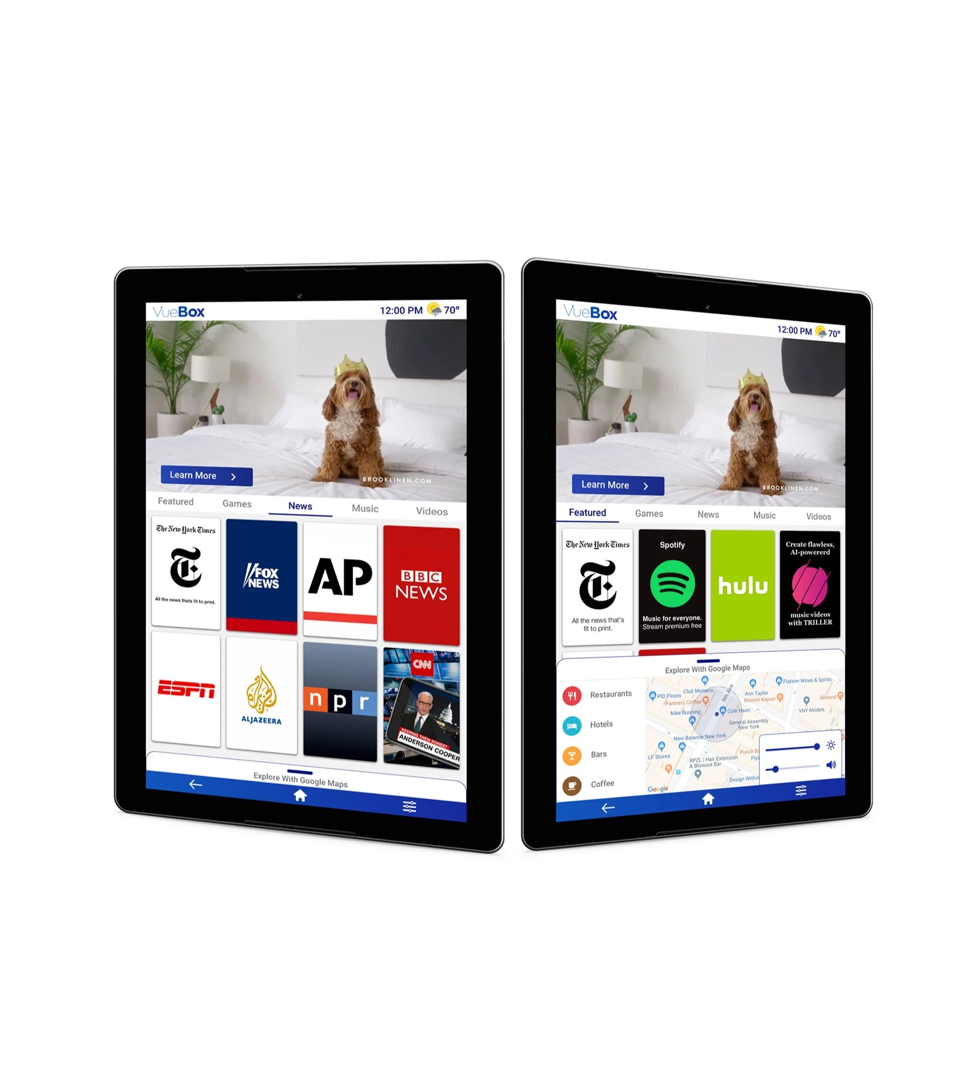
VueBox places entertainment tablets in rideshare vehicles. They sell the content space on the tablet to advertisers and share revenues with the drivers. VueBox asked our team to create an interface for their tablet that would drive more user engagement and increase the click-through rate. As a 3 person team, we researched, designed, tested, iterated on our design, completed a second round of tests and presented to the client.
Role
Lead Researcher | Scrum Master
challenge
Improve VueBox Android tablet interface in order to increase passenger engagement, and increase revenue earned through advertisements and app click-through rates.
tools
Sketch / Flinto / Abstract / Photoshop
Our research objective was to gain a better understanding of passenger behavior when using rideshare services. To further understand users feelings about how they engage with media content during their rides, and what kind of content they are most interested in engaging with. We also want to find out what is missing from the rider experience.
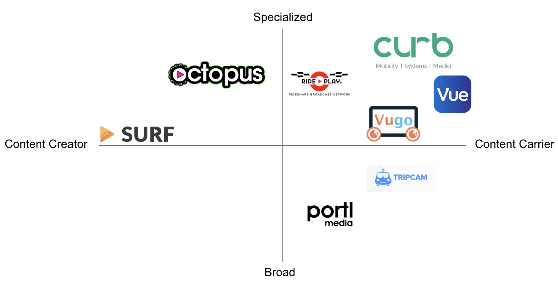
COMPETITIVE ANALYSIS
To better understand VueBox and the competitive space within rideshare entertainment providers we mapped them on a matrix to look for market gaps and opportunity areas. VueBox focuses on carrying content that already exist vs. being a content creator. This helped determine what type of content would be added to our redesign.
USER INTERVIEWS
We set up 20–30 minute interviews conducted in-person. The target market were people between the ages of 18–29. We interviewed 10 rideshare users about their in-car experience, and conducted 10 baseline usability tests on the existing tablet interface. We then simulated 5 baseline in- car ride share simulations on the existing Vuebox tablet.
Sample user interview questions:
How do you spend your time when you are alone in the vehicle?
If mobile device is used what are you using it for?
What do you like most about your rideshare experience?
AFFINITY MAPPING
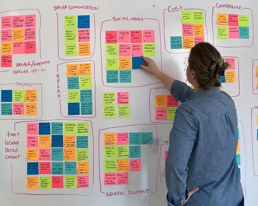
After conducting user interviews we synthesized the information. We looked for patterns and grouped the observations which led us to key insights we used to inform our design. Each interviewee is represented by a colored note containing observations from our interview. Key information we are looking for could be a motivation, goal, behavior, or preference they shared with us.
KEY USER INSIGHTS
Rideshare users:
want to be able to customize and control their environment. (music, volume, screen brightness)
want to ensure they are safe with real time location data such as routes, maps, and estimated time of arrival
value convenience and saving money
want access to location relevant content
PRIMARY PERSONA
Michelle represents the VueBox target audience. She’s a 26 year old professional in NYC who wants to know her location, control environment in the car and feel safe.
SECONDARY PERSONA
William is the secondary persona. He’s a 24 Year old professional who values efficiency while commuting. He likes to be productive and get work done while in the rideshare.
(click to expand)
(click to expand)
PROBLEM STATEMENT
How might we provide rideshare commuters with the ability to customize their ride, conveniently access the trip information they need, and have more control over their rideshare environment?
Design Studio
Design studios were conducted to rapidly ideate solutions. As a team, we conducted two rounds of sketching out rough ideas, followed by critiquing each other’s ideas. We then gathered together to whiteboard our combined solutions and features to create one collaborative design.
FEATURE PRIORITIZATION
Feature prioritization exercises were conducted to identify what features would be viable to incorporate as part of an initial minimal viable product and be the least expensive in both time and effort.
(click to expand)
INSIGHTS TO FEATURES
Below are the key insights and the design solutions we created to meet the users needs.
(click to expand)
Wireframing
The final design from our design studio was converted to a mid-fidelity prototype using InVision.
PROTOTYPE
Flinto was used to create the high-fi prototype for testing
USABILITY TESTING
We validated the features through usability testing. We wanted to simulate the rideshare experience as closely as possible for our test. Participants volunteered for a 10 minute simulated rideshare experience. The participant had no prior knowledge of why the test was being done. We wanted to see if they would naturally engage with the tablet with no prompting.10 participants were tested and videos of each test were recorded with a go pro camera mounted in the car.
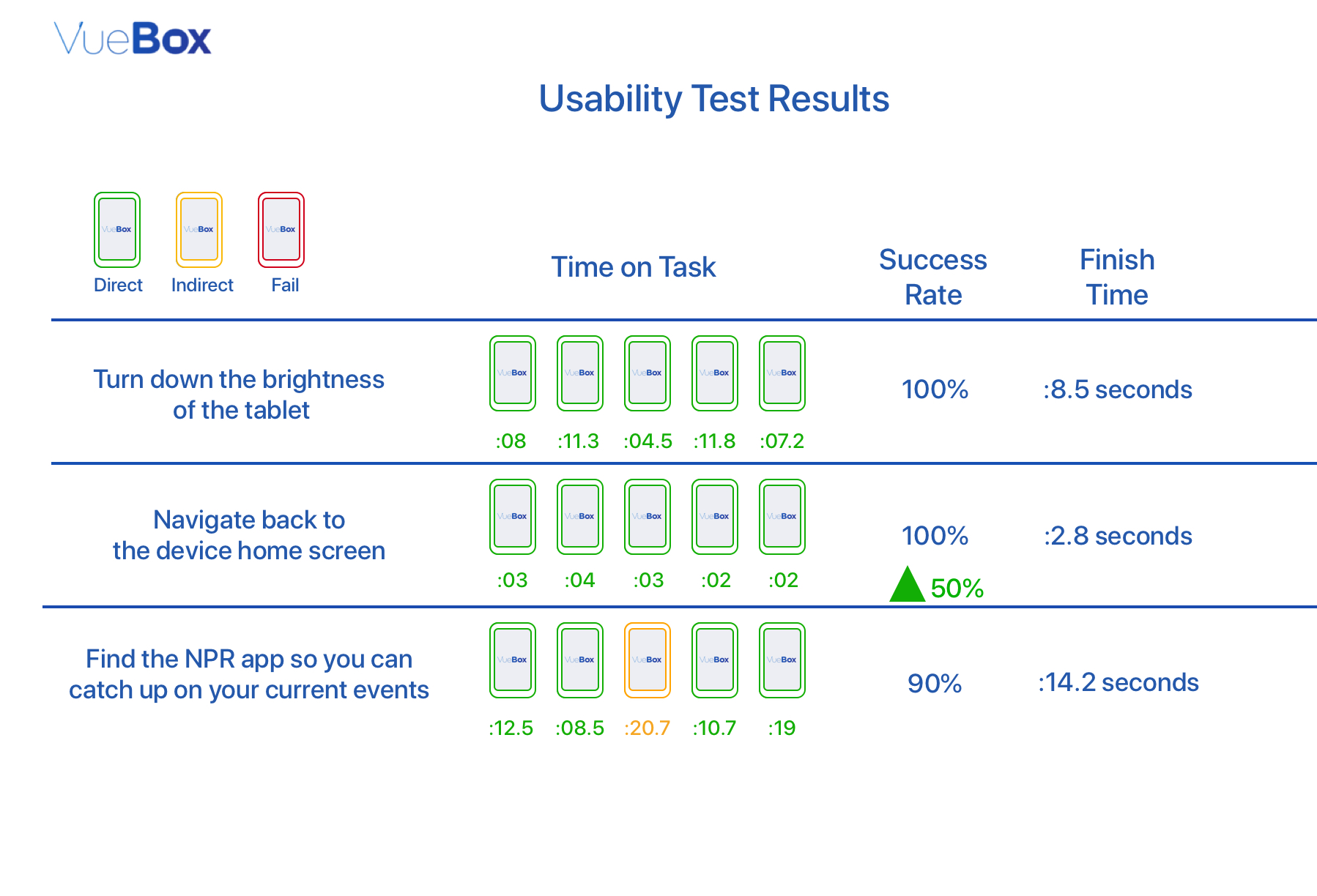
During the usability test we measured participants engagement with the tablet and for what length of time. At the end of the 10 minute test participants were asked to complete three tasks on the tablet. Users were assigned 3 tasks to complete.
Quantitative metrics used:
completion status
time-on-task
ease-of-use ranking
design iterations AFTER USer testing
Passengers found the text too small to read in a moving car. We increased the font size of all text in the body of the screen
Passengers knew the cards represented apps, but they were unsure of what some of them were and hesitated to click into them. We added additional context to the Content Cards to better inform passengers of what the apps could offer.
Riders had mixed expectations surrounding the Settings icon. We replaced the icon to better represent the brightness and sound bars available to them.
Despite riders knowing that the device is meant for their use, they were still unsure of what the device offered and were hesitant to engage with it without driver approval. We created a Vuebox Onboarding/Welcome video to reduce this hurdle.
NEXT STEPS
We recommend further testing to:
content card layout — opportunity for ad partners to customize what they’re showing to passengers
Potential for live stream events — based on user feedback wanting to see live updates
Utilize console space for additional branding and CTA


